毛玻璃效果制作总结
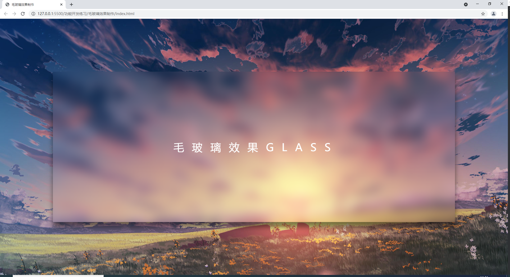
1.效果展示:
2.网页结构:
1
2
3
4
5
6
| <div class="banner">
<div class=" drop- shadow">
<div class=" glass"></div>
<span>毛玻璃效果GLASS</ span>
</div>
</div>
|
banner,drop- shadow,glass为相同大小的div
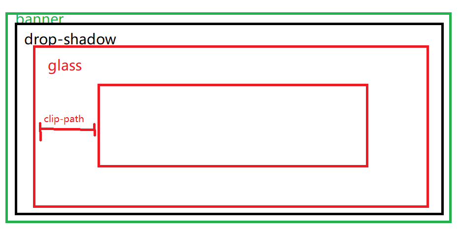
banner层用来添加总的背景,drop-shadow用来添加毛玻璃的阴影滤镜,glass用来做毛玻璃
3.原理与制作:
为banner与glass添加相同的背景图片,glass区域要保证与banenr区域的背景图相等,需要先将两张相同的背景图叠在一切然后在进行裁切, 所以glass与
banner等大且有相同的背景图,之后使用clip-path将glass进行裁切,然后为glass设置模糊滤镜,这样就形成了一个毛玻璃效果
1
2
3
4
5
6
7
8
9
10
11
12
13
14
15
16
17
18
19
20
21
22
| .banner{
width: 100Vw;
height: 100vh;
background: ur1( ./02.jpg);
background- position: center ;
background-size: cover;
display: flex;
justify-content: center;
align- items: center ;
}
.glass{
width: 100%;
height: 100%;
background: ur1(./02.jpg);
background-size: cover;
background- pos ition: center;
clip-path: inset(200px 200px);
filter: blur(20px);
display: flex;
justify-content: center;
align-items: center;
}
|
最后为drop- shadow添加drop- shadow滤镜为毛玻璃
添加阴影效果、
1
2
3
4
5
6
7
8
9
| .drop- shadow{
height: 100%;
width: 100%;
filter: drop- shadow( 0px 20px 10px
rgba(0, 0, 0, 0.5));
display: flex;
justify-content: center;
align-items: center;
}
|
4.总结
之前看到别人制作的毛玻璃效果非常漂亮,因此自己也想学习一下,毛玻璃效果中采用了clip path裁切与filter滤镜,对我来说并没有怎么使用过,没想到还可以使用滤镜添加阴影效果!以上就是毛玻璃效果的一种实现思路了~
如果这篇文章对你有帮助,可以bilibili关注一波 ~ !此外,如果你觉得本人的文章侵犯了你的著作权,请联系我删除~谢谢!